WESTBURY
WESTBURY
Experience the Westbury difference for yourself. Visit our website to explore our extensive selection of vape products and discover why Westbury is the preferred choice for vapers everywhere.
Category
Logo Design
Year
2021


Development
Development
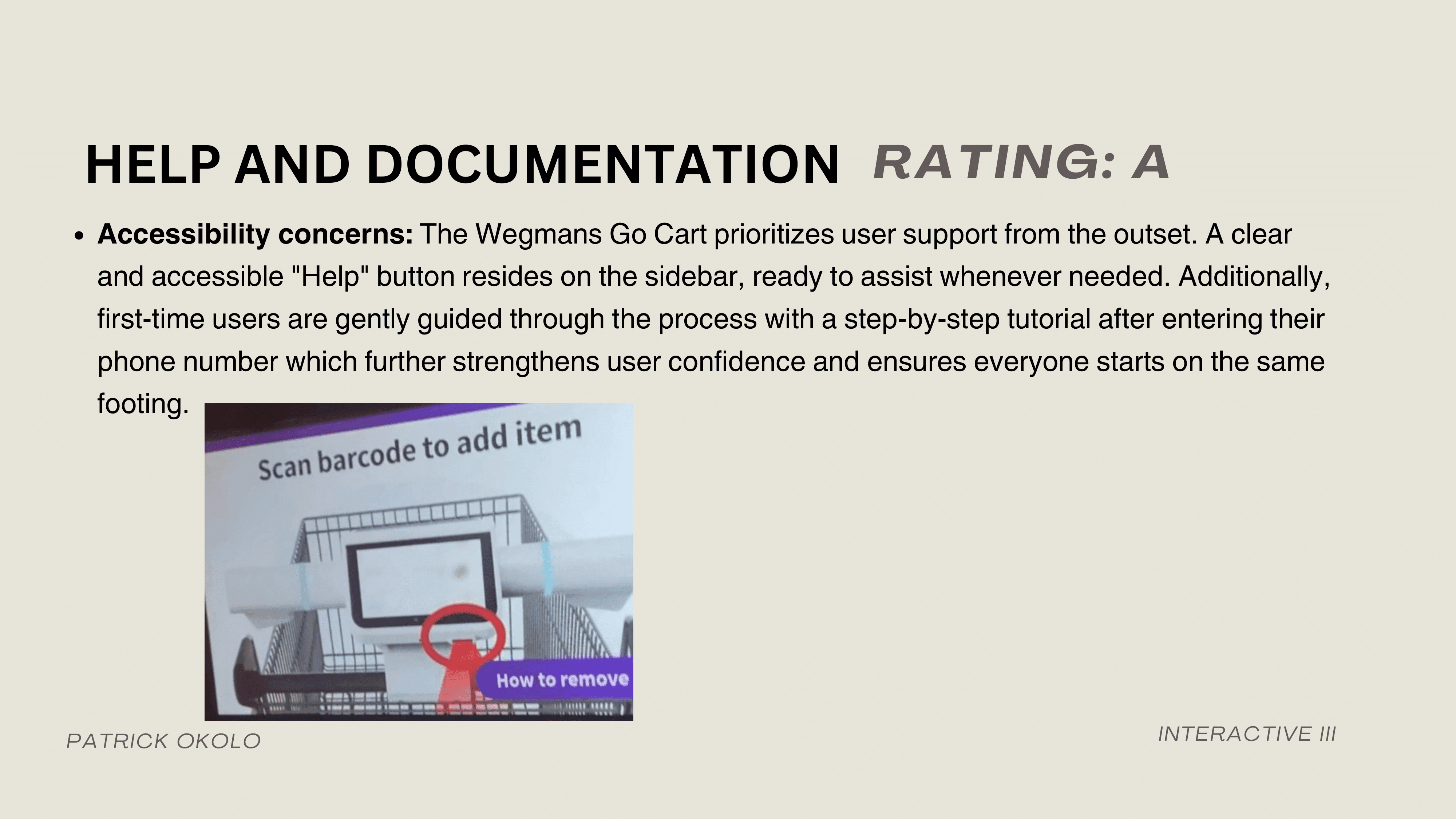
I really wanted to commit to the Wegmans style, because I felt as though their typical design systems fall short and turn out a bit bland. I wanted my styleguide to breathe nostalgia and homminess.
I really wanted to commit to the Wegmans style, because I felt as though their typical design systems fall short and turn out a bit bland. I wanted my styleguide to breathe nostalgia and homminess.

MAIN DASH
EMPTY CART/SHOPPING STARTED
FILLED SHOPPING CART
OVERLAY AFTER START
CHOOSE A LIST


TAKEAWAYS
MY WORK IN ACTION
On reflection, some elements, like the large banner, feel a bit overwhelming, and the lists dropdown could be more user-friendly for multitaskers. While I’m pleased with the much needed facelift of the Shopic screens, there’s room to simplify further to better serve Wegmans' older demographic.
Development
Development
There's no way this conent will fit on mobile. Here, take this link to process doc instead! HEURISTIC EVAL & PROCESS DOC
I really wanted to commit to the Wegmans style, because I felt as though their typical design systems fall short and turn out a bit bland. I wanted my styleguide to breathe nostalgia and homminess.
I utilized a 48 row by 32 column baseline grid. This grid structure allowed for a high level of flexibility and precision in the layout. With three columns, I could allocate more space for product details, imagery, and key actions without cramming information.
MAIN DASH
EMPTY CART/SHOPPING STARTED
FILLED SHOPPING CART
OVERLAY AFTER START
CHOOSE A LIST
MAIN DASH
CHOOSE A LIST
CHOOSE A LIST
OVERLAY AFTER START
OVERLAY AFTER START
I really wanted to commit to the Wegmans style, because I felt as though their typical design systems fall short and turn out a bit bland. I wanted my styleguide to breathe nostalgia and homminess.
I utilized a 48 row by 32 column baseline grid. This grid structure allowed for a high level of flexibility and precision in the layout. With three columns, I could allocate more space for product details, imagery, and key actions without cramming information.
TAKEAWAYS
MY WORK IN ACTION
On reflection, some elements, like the large banner, feel a bit overwhelming, and the lists dropdown could be more user-friendly for multitaskers. While I’m pleased with the much needed facelift of the Shopic screens, there’s room to simplify further to better serve Wegmans' older demographic.
More Works More Works
More STUFF :) MORE THINGS :)

YEAHHBUDYYY
YEAHHBUDYYY
YEAHHBUDYYY
YEAHHBUDYYY
PATRICK OKOLO ©2024
GO BACK TO TOP
PATRICK OKOLO ©2024
GO BACK TO TOP
PATRICK OKOLO ©2024
GO BACK TO TOP
PATRICK OKOLO ©2024
GO BACK TO TOP