rayman buttons
rayman buttons
For this 4-5 week project, I was tasked with designing buttons for a company/design system of my choice. I chose the Rayman game series because I felt as though the personality of the games was not reflected in the UI . My main goal was to craft buttons that were intentionally impractical yet retain usability and capture the style of UbiArt Framework.
Category
Case Studies
Year
2024
The slider features a draggable eyeball icon, while the toggle states transition between a "Play" (intact eyeball) and "Pause" (damaged eyeball) state. Hovering triggers a subtle twitch animation, adding character while maintaining clear user feedback.
The slider features a draggable eyeball icon, while the toggle states transition between a "Play" (intact eyeball) and "Pause" (damaged eyeball) state. Hovering triggers a subtle twitch animation, adding character while maintaining clear user feedback.
The slider features a draggable eyeball icon, while the toggle states transition between a "Play" (intact eyeball) and "Pause" (damaged eyeball) state. Hovering triggers a subtle twitch animation, adding character while maintaining clear user feedback.
Research
Research

Research
Research
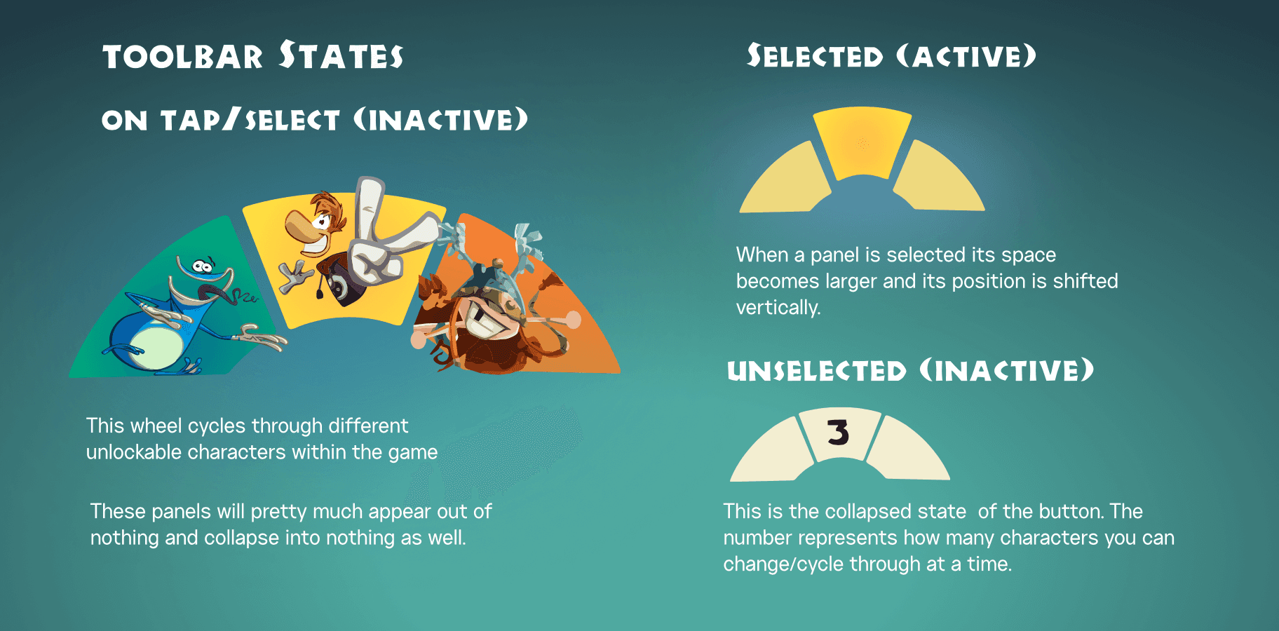
The interface uses a wheel-based system where selected characters’ panels enlarge and shift to indicate activation. In its collapsed state, the toolbar shows minimal information.
The interface uses a wheel-based system where selected characters’ panels enlarge and shift to indicate activation. In its collapsed state, the toolbar shows minimal information.
Initially, a "3" appeared in the center of the collapsed state to indicate how many characters could be swapped. However, this raised confusion—why not have the number on all panels or above/below? And if the player unlocked more than three characters, where does that number go?? To maintain a cleaner interface, the "3" GOT SCRAPPED!
Initially, a "3" appeared in the center of the collapsed state to indicate how many characters could be swapped. However, this raised confusion—why not have the number on all panels or above/below? And if the player unlocked more than three characters, where does that number go?? To maintain a cleaner interface, the "3" GOT SCRAPPED!
Research
The interface uses a wheel-based system where selected characters’ panels enlarge and shift to indicate activation. In its collapsed state, the toolbar shows minimal information.
Initially, a "3" appeared in the center of the collapsed state to indicate how many characters could be swapped. However, this raised confusion—why not have the number on all panels or above/below? And if the player unlocked more than three characters, where does that number go?? To maintain a cleaner interface, the "3" GOT SCRAPPED!
More Works More Works
More STUFF :) MORE THINGS :)

RIT Beyond Fashion
Motion & Animation
2023
2023
RIT Beyond Fashion
Motion & Animation
2023
2023
RIT Beyond Fashion
Motion & Animation
2023
2023
RIT Beyond Fashion
Motion & Animation
2023
2023

Shopic Concepts
Case Studies
2024
2024
Shopic Concepts
Case Studies
2024
2024
Shopic Concepts
Case Studies
2024
2024
Shopic Concepts
Case Studies
2024
2024
YEAHHBUDYYY
YEAHHBUDYYY
YEAHHBUDYYY
YEAHHBUDYYY
PATRICK OKOLO ©2024
GO BACK TO TOP
PATRICK OKOLO ©2024
GO BACK TO TOP
PATRICK OKOLO ©2024
GO BACK TO TOP
PATRICK OKOLO ©2024
GO BACK TO TOP